Curtain Color Psychology: How Colors Affect Mood
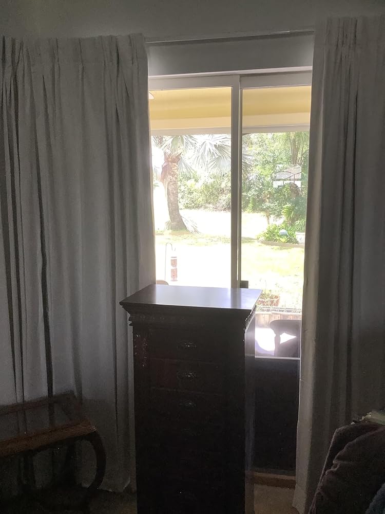
On the first Saturday after her March bedroom refresh, Emma hung the pale gray curtains she had been saving for weeks. By 7 p. m., the room she wanted to feel restful looked colder, flatter, and less inviting than it had before.
That is the part most shoppers don't expect. Curtain color psychology is not just about whether blue feels calm or yellow feels cheerful. It is about how color, light, texture, and privacy work together once the fabric is hanging in a real room. In this guide, you will learn how curtain colors affect mood, which shades work best for calm, cozy, airy, and sleep-friendly spaces, and how to test color before you buy.
How Curtain Color Psychology Works in Real Rooms

Most articles reduce curtain color psychology to a color wheel. That is too simple to be useful. A curtain color does not act alone. It changes with daylight, lamp light, room size, wall undertones, and the type of fabric you choose.
That is why the same ivory curtain can feel warm and soft in one home, but dull in another. A dusty blue panel can read peaceful in a bright living room and chilly in a north-facing bedroom. The mood comes from the full setup, not from the hue in isolation.
Sherwin-Williams explains that room direction changes the way color behaves throughout the day. North-facing rooms get cooler, lower natural light, while south-facing rooms stay warmer and more consistent. East- and west-facing rooms can swing between warm and cool depending on the hour.
That matters because mood is partly visual comfort. If the curtain color fights the light, the room rarely feels settled.
There is also a practical side. Sleep Foundation notes that light exposure affects circadian rhythm, melatonin production, and sleep cycles. In other words, the emotional effect of a curtain color is tied to light control too. A pale curtain may look soothing, but if it lets in too much early light, the room may still feel less restful at the moment you need it most.
Want to compare colors in your own room before you commit? Start with curtain swatches. A small sample in morning, afternoon, and evening light will tell you more than any product photo.
Why mood is more than a symbolic color meaning
Blue is often called calming. Red is often called energizing. Green is often called balancing. Those labels are useful, but they are only a starting point.
A review published on PMC found that blue light can increase alertness and attention-task performance. Another study on warm and cool light conditions found that red environments increased tension, anger, depression, fatigue, and anxiety in the test setting, while blue and white conditions performed better for calmness and visual comfort. The takeaway is not that one color is always good or bad. It is that color and lighting interact, and that interaction shapes how a room feels.
That is why a smart curtain decision starts with one question: what do you want this room to feel like when you actually use it?
Choose the Mood Before You Choose the Curtain

If you skip this step, every color option starts to look equally possible. Once you define the feeling you want, the decision gets much easier.
Calm and restful
If your goal is a room that helps you slow down, look for softened colors with low visual tension. Good choices often include:
- muted blue-green
- warm greige
- mushroom
- soft taupe
- dusty olive
These shades tend to feel steadier than bright white or high-contrast patterns. They also pair well with lined or blackout fabrics when the room is used for sleep or quiet downtime.
Emma discovered this in her bedroom. Her pale gray curtains looked calm on the website, but they turned cold in the room's north-facing light. When she swapped them for a warmer mushroom blackout panel the next weekend, the room immediately felt softer and more complete.
The color was not dramatically darker. It was simply warmer and better matched to the light.
Cozy and warm
For a cozier mood, move toward warmer neutrals and grounded earthy tones. Think flax, oatmeal, clay, terracotta, tobacco, deep olive, and camel.
These colors usually work well in spaces used after sunset, especially dining rooms, dens, and living rooms where you want the room to feel layered instead of sharp. Texture helps here too. A warm neutral in a linen-look fabric often feels friendlier than the same tone in a slick, flat weave.
If you are searching for the best curtain colors for mood, this is often the safest place to start. Warm, muted shades are usually easier to balance than bright, high-contrast colors.
Bright and airy
If you want a room to feel open and light, choose colors that reflect more light and stay visually quiet. Good options include soft white, creamy ivory, pale flax, light stone, and muted sage.
Bright and airy does not mean stark. In many homes, true bright white curtains can look clinical against warmer walls or wood tones. An off-white with a little warmth usually feels easier to live with.
Focused and productive
For a home office or study corner, you usually want a room that feels clear and ordered, not sleepy and not overstimulating. Dusty blue, muted green, charcoal accents, and structured neutrals often work well.
This is where curtain color psychology becomes practical instead of decorative. A color that helps a room feel composed can support the way the space is used, especially if glare control matters during the workday.
Social and inviting
If the room is meant for conversation, family dinners, or gathering with friends, warmer colors often do more work. Terracotta, olive, muted gold, warm beige, and rich taupe can all make a room feel more welcoming.
That does not mean every social room needs a dark curtain. It means the curtain should help the room feel generous, not sterile.
Best Curtain Colors by Mood and Room

Once you know the feeling you want, the next step is to match that mood to the actual room.
Best curtain colors for bedroom mood
Bedrooms usually need the strongest balance between emotional comfort and performance. The room should feel calm, but it also needs good light control if sleep is a priority.
That is why bedrooms often do best with:
- warm ivory
- greige
- dusty blue
- muted olive
- soft taupe
If the room gets bright early morning light, start with blackout curtains and then narrow the palette. NICETOWN's own bedroom sleep guide notes that true blackout fabrics can still block around 95% of light even when the visible fabric color is not especially dark.
In practice, that gives you more freedom. You do not have to choose only charcoal or navy to create a sleep-friendly room. A warm ivory blackout curtain can still look gentle while supporting better darkness.
If you want more detail on function first, NICETOWN's guide to bedroom curtains for better sleep is the right companion read.
Best curtain colors for living room mood
Living rooms often need range. They may be bright during the day, used for family time in the evening, and visible from other spaces in the home.
For a flexible living room mood, strong options include:
- flax and oatmeal for warmth
- ivory and stone for a lighter look
- dusty blue or sage for soft color
- charcoal or olive for more contrast
Carlos ran into this after repainting his living room in April. The walls were bright white, the sofa was oatmeal, and he ordered pure white curtains because they felt safe. Once the panels went up, the room felt washed out by midafternoon.
He changed to a slightly deeper flax privacy panel, and the room finally had shape. The walls looked cleaner, the sofa looked richer, and the space felt calmer without getting darker.
If you need privacy without turning the room into a cave, privacy curtains are usually a better starting point than the heaviest blackout option.
Best curtain colors for dining room mood
Dining rooms benefit from a little more atmosphere. The right curtain color can make a daytime room feel polished and an evening room feel intimate.
Good dining-room directions include:
- muted terracotta
- deep olive
- warm beige
- rich taupe
- charcoal with softer textures
These choices work because they add visual weight without shouting. NICETOWN's existing dining room curtain guide already leans in this direction by connecting color and texture to ambiance, which is exactly the right lens for this type of room.
Best curtain colors for a home office or dual-use room
A guest room that doubles as an office, or a study corner in a bedroom, needs control more than drama. The best colors usually stay restrained:
- dusty blue
- eucalyptus green
- warm gray
- mushroom
- structured off-white
In June, Maya turned her spare room into a weekday office and weekend guest room. She tested two swatches at 8 am and again at 7 pm: one was a stark white sheer, the other a muted blue privacy fabric. The white looked crisp at noon but glary on video calls and flat under warm lamps.
The blue looked balanced in both settings, so that is what she chose. The result was not flashy, but the room felt easier to work in and more settled at night.
A Quick Mood-to-Color Guide
If you want a faster decision tool, use this table as a starting point.
| Mood goal | Good curtain colors | Best room types | Watch out for |
|---|---|---|---|
| Calm and restful | Greige, mushroom, dusty blue, muted olive | Bedrooms, reading corners | Icy grays in cool rooms |
| Cozy and warm | Flax, terracotta, camel, deep olive | Dining rooms, dens, living rooms | Too much orange or red |
| Bright and airy | Ivory, soft white, light stone, pale sage | Living rooms, breakfast areas | Stark white against warm walls |
| Focused and clear | Dusty blue, muted green, charcoal accents, warm gray | Offices, dual-use rooms | Colors that feel too dull or too cold |
| Social and inviting | Warm taupe, muted gold, olive, tobacco | Dining rooms, family rooms | Overly dark fabric in dim rooms |
Need a closer fit than ready-made sizes allow? Custom curtains make it easier to control both the final color effect and the finished look at the window.
Fabric and Opacity Change the Feeling Too
Curtain color psychology is only half of the decision. Fabric and opacity change the way that color behaves.
Sheer, privacy, and blackout curtains feel different
A sheer ivory curtain and a blackout ivory curtain do not create the same mood. The sheer version feels lighter, airier, and more relaxed. The blackout version feels steadier, quieter, and more enclosed.
That is why it helps to choose function before fine-tuning color:
- Use sheers when you want softness and maximum daylight.
- Use privacy curtains when you want filtered light and daily flexibility.
- Use blackout curtains when sleep, glare reduction, or strong light control matters most.
The right function makes the right color more believable. Without that match, even a beautiful shade can feel wrong.
Texture changes warmth
Texture adds emotional tone. Linen-look fabrics usually feel more relaxed and organic. Velvet-like surfaces feel richer and more cocooning. Smooth blackout fabrics often read cleaner and more modern.
If two swatches are close in color, the one with better texture for the room often wins. This is especially true with neutrals. Oatmeal can feel casual and soft in a woven fabric, but more formal or flat in a smoother finish.
Dark colors can feel grounding or heavy
Dark curtains are not automatically gloomy. In a large room with enough daylight, charcoal, forest green, and deep taupe can feel grounded and elegant.
Problems usually start when a dark curtain is combined with low light, heavy fabric, and no contrasting elements nearby. If the room already feels dim, a lighter or warmer variation often creates a better emotional balance.
How Light Changes Curtain Color Psychology
This is the step many shoppers skip, and it is the reason so many curtain choices disappoint after installation. Good curtain color psychology always accounts for the light the room actually gets.
North-facing rooms
North-facing rooms often pull colors cooler. If the space already feels shadowy, curtains in icy white, steel gray, or blue-heavy gray can make the room feel even less inviting.
In these rooms, warmer shades usually perform better:
- ivory
- oatmeal
- flax
- mushroom
- soft greige
South-facing rooms
South-facing rooms are more forgiving because they get stronger, warmer light for more of the day. You can often use cleaner whites or deeper contrast colors without making the room feel severe.
That said, the best choice still depends on the mood you want. Bright white might feel fresh. Flax might feel softer. Olive or charcoal might feel more tailored.
East- and west-facing rooms
East- and west-facing rooms change more dramatically. A curtain can look warm and glowing in the morning, then cooler and flatter later on.
If your room changes a lot across the day, test balanced shades first. Soft neutrals, muted greens, dusty blues, and grounded earth tones usually stay steadier than highly reflective white or very cold gray.
Artificial light matters too
Do not stop at daylight. Warm bulbs can make cream, beige, and blush curtains look richer. They can also make some yellow-based fabrics look too golden. Cooler bulbs can sharpen grays and blues, but may also make a room feel less relaxed.
This is one reason swatches matter so much. A fabric that seems perfect at noon can change completely once the lamps are on.
How to Test Curtain Color Before You Buy

The easiest way to avoid a disappointing curtain choice is to slow the decision down by one step.
Order swatches first
If you are choosing between two or three close shades, small swatches usually settle the question fast. Hold them next to the wall, floor, sofa, and rod finish.
Check the fabric in three moments
Look at the swatches in:
- morning light
- midday light
- evening lamp light
This takes less than one day, and it catches problems that online photos cannot.
Judge the room, not just the sample
Do not ask only, "Do I like this color?" Ask:
- Does this make the room feel calmer or busier?
- Does it feel warmer or colder than I want?
- Does the opacity fit the room's real job?
- Will this still feel right at 7 p. m.?
If you need help with buying details beyond color, NICETOWN's curtain buying guide covers fabric, heading style, and hardware choices in more depth.
Ready to narrow your options the practical way? Compare curtain swatches, then move into custom curtains or function-led collections once you know the mood you want.
Mistakes That Make the Room Feel Wrong
- Choosing by symbolic color meaning alone
- Ignoring room direction and daylight
- Picking a color that suits the wall but not the room's function
- Using bright, stimulating colors in a room meant for rest
- Judging the fabric under one light source only
- Forgetting that texture can warm or cool a color
Most curtain mistakes are not dramatic. They are small mismatches that add up. The room feels slightly colder, slightly busier, or slightly dimmer than you expected. Fixing that usually means stepping back and asking what the room needs emotionally and practically, not just what shade looks good on a product grid.
FAQ: Curtain Color Psychology and Mood
Do curtain colors really affect mood?
Yes. Curtain colors affect mood because they change the visual temperature, brightness, contrast, and overall energy of a room. The effect becomes stronger when you combine color with the right texture and light control.
What curtain colors feel the calmest?
Muted blue-green, warm greige, mushroom, soft taupe, and dusty olive usually feel the calmest. They tend to create less visual tension than brighter, sharper colors.
What curtain colors make a room feel cozy?
Warm neutrals, terracotta, camel, deep olive, and rich taupe often make a room feel cozier. Texture helps too, especially linen-look and other woven finishes.
Can dark curtains make a room feel depressing?
They can if the room already feels dim and the fabric is very heavy. In a bright room, dark curtains often feel grounded and elegant instead.
What curtain colors are best for sleep?
Warm ivory, greige, dusty blue, muted olive, and soft taupe are strong options for sleep-focused rooms, especially when paired with blackout construction.
Should mood or wall color come first?
Mood should come first. Wall color still matters, but the room will feel more successful when the curtain supports the way the space is used and the emotion you want from it.
Start With Feeling, Then Fine-Tune the Shade
The best curtain choice is rarely the one with the loudest personality. It is the one that makes the room feel the way you want it to feel when real life is happening there.
If you want a calmer bedroom, choose a softer palette and stronger light control. If you want a warmer dining room, move toward grounded tones and richer texture. If you want a brighter living room, use lighter colors that still work with your light and furniture instead of defaulting to the starkest white available.
Start with the mood. Test the fabric in real light. Let function shape the final call when privacy, glare, or sleep matters. When curtain color psychology lines up with light and function, the room usually feels right almost immediately.
If you are ready to move from inspiration to a practical shortlist, begin with curtain swatches, explore blackout curtains for sleep-focused rooms, or review the FAQ if you need help before ordering.
Before You Go…
Here are a few handpicked articles to inspire your next self-care moment.